Paws & Purrs Rescue
Cats, Dogs, and Small Animals
Cats, Dogs, and Small Animals
Grid is extremely appreciative of the work that non-profits do for our communities. Some of our most rewarding experiences have come from working with these groups. Paws & Purrs Rescue came to us looking for an attractive brand and website that would help improve their rate of adoptions. Every member of our team cares a great deal about animals, so we were eager to jump in and assist!

We began our work by holding a focused listening session between the client and our team. We asked a range of questions to better understand the clients work, the obstacles they face, and the successes that they’ve had. We inquired about previous marketing efforts, events they host, and reviewed marketing collateral that they already had. From this meeting it was clear that the largest hurdle to finding foster or forever homes for many of their pets was an unprofessional logo (which worried potential owners that the operation wasn’t held to a high standard), a confusing website experience, and a difficult application process.
Next was our research phase. Along with the client’s input, we identified local and national animal-related businesses who were doing well and brainstormed over the consistent trends we saw in regards to their branding, websites, and application process. We saw that iconography wise it was most typical to have paw prints, hearts or the silhouettes of animals. The most used colors were pastel versions of greens, purples, pinks and blues. Websites prominently featured one or two available pets, success stories, and easy links for donating or getting in touch.
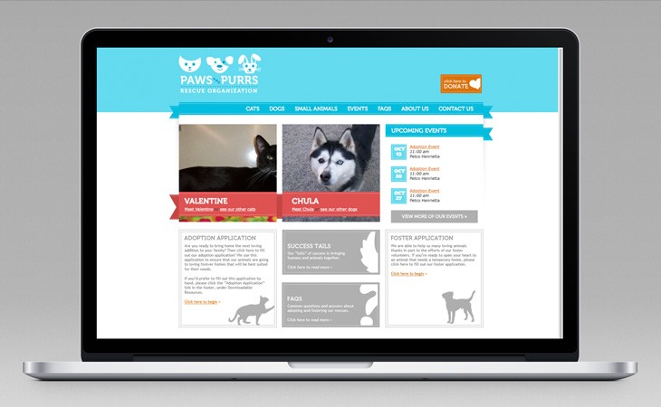
Using all of this information we focused on designing a logo that would remain consistent with the industry standards (to promotes credibility), but also unique so that the client would stand out against their competitors. We finalized on a design that featured a cat, dog and rabbit icon as a subtle reminder that there were more than just cats and dogs available for adoption (they often took in abandoned ferrets, rabbits or hamsters). We choose a cool blue and white palette that was inviting and home-y, but still professional.
We then used this brand as a guideline for the website. Our biggest focus was to drive viewers to the most important pieces of information available on the site - how to donate / make a donation, pets that are available for adoption, and the adoption form. Since making a donation is the easiest and quickest way to become involved with Paws & Purrs Rescue, we highlighted that process by placing a “Donate” button in the top right hand corner of every page. For adoptions, we focused 3/7 of our navigation options on driving traffic directly into profiles of available animals, and featured two animals on the homepage at all times.
The adoption form was one of our biggest challenges. There were many “caveats” that would require the person filling out the form to provide additional information, or skip over certain sections that were not relevant. We utilized a robust form system that would allow us to set a series of intricate rules on the form, that would dynamically change the form as you progressed to show only the fields that were relevant to what you needed to fill out.
After the new website launch, the client remarked at how incredible the difference in responses was. Before the new website launched, they often saw website traffic that bounced from the homepage without ever viewing the animals up for adoption, and saw an incredibly high amount of abandonment rate on their adoption form (indicating the applicant found it too complicated or involved to be worth the time). After launch, they saw increased website traffic on the pages that were most important, and were receiving more completed applications than they ever had before. We were very happy to have assisted in finding so many animals their forever homes.