Our Work: CAPS Aviation Rebrand
by on Nov 21, 2017

by on Nov 21, 2017
In 1983, Neil Looy founded Corporate Air Parts and Services, a humble maintenance and repair station for JetStair aircraft. Over the past 30 years, the business has evolved into a multi-faceted, one-stop shop which services Gulfstream and newer business aircraft, trains flight crews, and provides logistical support around the globe. In 2017, the business transitioned from Neil to his daughter Jennifer, who brought with her an incredible amount of experience, a strong sense of leadership, and an outlook for the business that went far beyond it’s current capacities.
One of the first tasks she wanted to undertake was a full evaluation of the Corporate Air Parts and Services brand, including an assessment of the business name, logo, and brand as a whole. The brand had not changed much since it’s early beginnings, and Jennifer was adamant about redesigning the brand to match their status as a leader in their industry. The brand needed to better characterize their forward thinking attitude, expertise, and professionalism.
We began this work by researching the current Corporate Air Parts and Services brand, their products and services, the companies they work with, their ideal customers, the current state of the industry, their competitors, and other brands that their ideal customers would be attracted to. We also interviewed internal staff, at various levels, about how they viewed the company and their perception about the direction the company was heading. Although our goal was to improve and modernize the brand, we wanted to make sure it was built solidly around the companies “personality” and vision - without that, we knew it could not be a successful rebrand.
One of the primary concerns for a new brand was that the business name, “Corporate Air Parts and Services”, no longer accurately reflected the range of their capabilities. As we discussed the rebrand internally and externally, we found it was very common for people to refer to them simply as “CAPS”. It was a moniker that was already very well recognized within the industry, and did not move too far away from the original roots. Based on this and our market research, we felt strongly that the best way to move forward would be to rebrand as “CAPS Aviation”.
The next step was to design a new logo that would stand out among competitors, while still fitting in with the industry, that looked modern and forward thinking, yet reflected their decades of experience and integrity. We presented the client with two logo options, both of which we felt could serve them well.
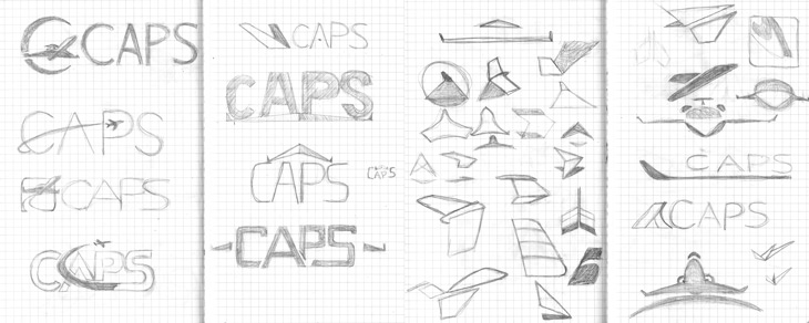
The first was a classic interpretation of their brand. It paid homage to the industry through the use of the plane iconography, and utilized the original Corporate Air Parts and Services brand colors of grey and dark blue. This was our corporate option - one that we knew would feel a little safer because it didn’t stray “too far” from other brands in their industry.
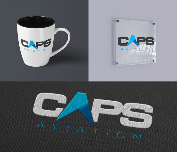
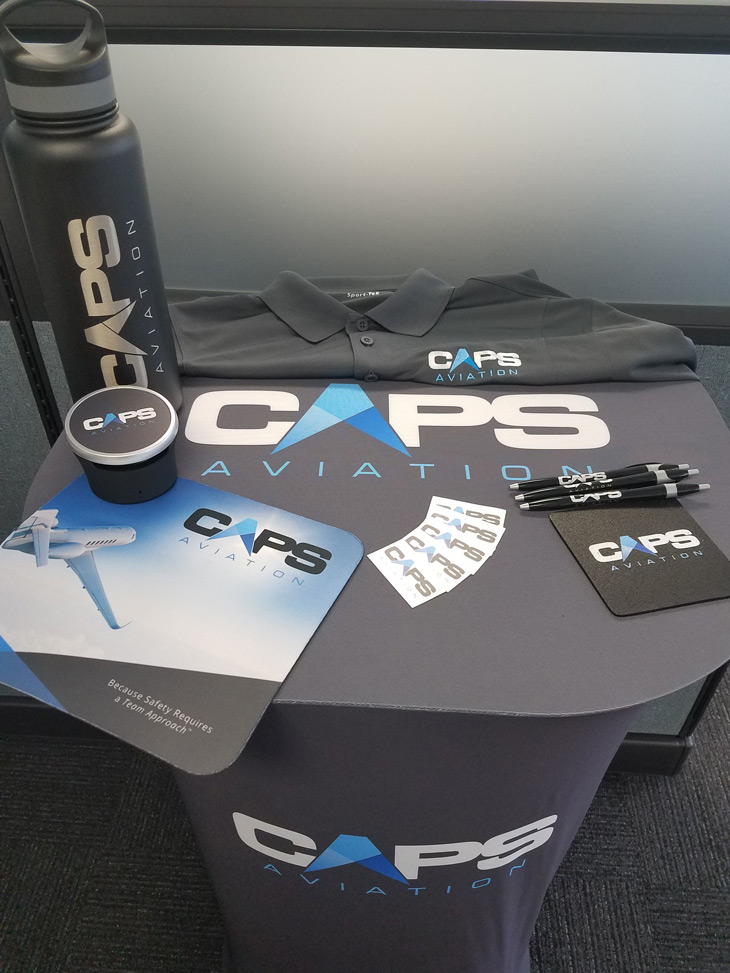
Our second option, and our top pick internally, was the riskier choice. We utilized vibrant colors coupled with bold text and strong angular shapes to make a statement. The “blades” of the overlapping A were reminiscent of the blades of a prop aircraft, and symbolized the breadth of complimentary services that CAPS provides. It takes a team to maintain a fleet of aircraft, and CAPS Aviation could serve as your trusted partner.
As we expected, the client initially leaned toward the first option. It felt like a more natural progression of the brand - something safer, and more well known. However, by the end of our presentation, she really began to see how the second option could drive the CAPS Aviation forward in a new and exciting direction. We provided her with some visual examples of how the second option could be used “in real life” - mocked up on a sign, or used on a water bottle. After a few days, the potential behind the brand really sunk in, and she was in love.
Since then, we have been applying the new brand to a variety of different areas as the need has arisen. Trade show backdrop and table draping, water bottles, pens, mousepads, stickers, coasters, apparel, branded giveaway items, business cards, letterhead, presentation templates, and (coming soon!) a new website! It’s been an absolute pleasure working with CAPS Aviation through their rebrand, and seeing the results of our work come to life!
If your company is considering a rebrand, talk to us first! We can help outline the process, set up a timetable for the work and rollout, and determine the budget necessary to bring the new brand to life!