Our Work: Three Heads Brewing Rebrand
by on Nov 25, 2015

by on Nov 25, 2015
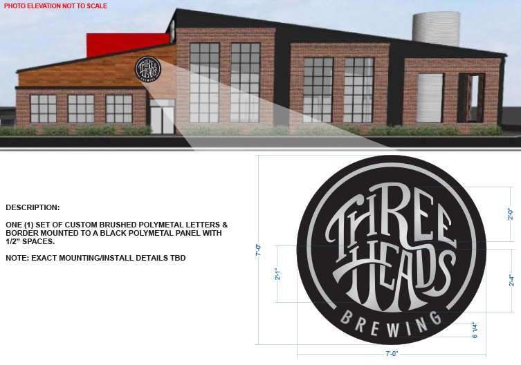
With their new location almost finished and ready for operation, Three Heads Brewing, a craft beer brewer in Rochester, N.Y., wanted a fresh new logo to go along with their change in location. Over the years their old logo had been adapted into several different versions, some shortened, others more stylized, which created inconsistency with their brand. They felt the move was a good time to create a single overarching logo to accurately represent their brand.
Anytime we take on work for a client, we like to begin with a question and answer session to discuss their thoughts, ideas and expectations for the finished product. We want to make absolutely sure everyone is on the same page as we begin the process, especially when creating something as personal and forward facing as a company’s logo. During our meeting with Three Heads Brewing, they explained to us they wanted their logo to be in a style reminiscent of the colorful and highly-stylized art of the psychedelic era. They also wanted it to incorporate a local Rochester element to show their hometown roots.
Knowing the direction they wanted to take, we began the research stage of the project. We looked at competitors, other beer company logos, and the beer industry as a whole to get an idea of current trends and where Three Heads Brewing might fit in the mix. This involved several trips to local beer stores (for research purposes, of course) to see how beer brands from across the country market their products. Next, we created an inspiration board filled with various examples of psychedelic imagery. This included rock concert posters from the 60’s and early 70’s, vintage clothing, and logos from the era, along with Rochester landmarks and themes we felt would be appropriate for a logo. We presented these examples to the client to find which ones resonated with them, and which examples they felt were heading in the wrong direction. After a few rounds of back and forth, we felt we had a solid understanding of the client’s preferences.
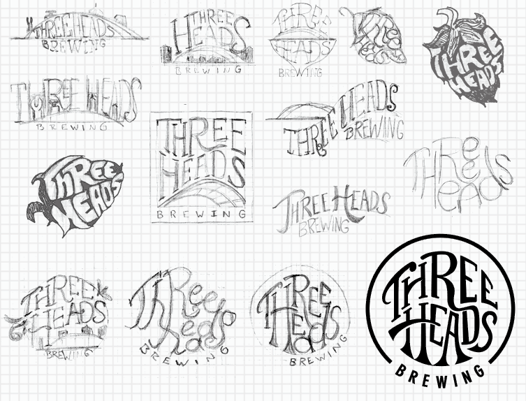
Next it was time to put pen to paper and start developing rough logo concepts. This is the phase where our designers really get to flex their creative muscles! We started with pencil sketches outlining a few logo directions, which we presented to Three Heads Brewing to see which sketches best captured what they were looking for in a logo. Then, we made digital versions of several logo options to continue tweaking using graphic design programs.
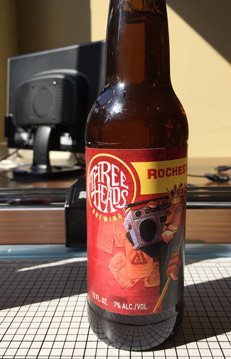
This also let us print the logos in a life-size mock-up to determine how they worked on individual bottles, boxes, and anywhere else it might be used. Our designers literally took printed logos and taped them onto glass beer bottles, then took pictures from several different angles to see how much information was still visible. This let us see if the logos were legible, how they looked from different angles, and what they would look like among other bottles on a shelf in a retail store location.
This is an important step in the design process, as logos can appear very different in the real world once they’ve left the computer screen. For example, when a customer is holding the bottle in their hand, do their fingers cover up any important information? If they’re obscuring part of the logo, does it change its meaning? It’s important to remember your business has little to no control over how your product is presented on store shelves, so making it work in as many situations as possible is a must.
Our earlier research indicated that Three Heads Brewing’s customers were more than just casual beer drinkers. They took into consideration the brewing process, ingredients, style, IBUs and more when deciding on a beer to purchase. As was just mentioned, it’s impossible to know just how every store will display your products, so it’s essential to clearly display important information. In this case, both the alcohol by volume and IBU numbers were factors that had an influence on customers’ beer purchasing decisions. We found that if this information or the beer’s style was placed too low on the packaging, it could potentially be obscured by the shelf edges in retail locations. A little information loss at the point of sale might be OK for brand loyalists who instantly recognize their style’s packaging and were going to make that purchase anyway- but when trying to appeal to new consumers, you only have a few seconds to make an impression on them as they scan store shelves bursting with competitor’s offerings.
We also had to consider the prominence of the artwork used on Three Heads Brewing’s individual beer styles. Each painting is made by a local artist who incorporates various Rochester landmarks and themes into them. They’re typically very colorful and filled with lots of information. We wanted the artwork to be as large as possible (‘leading the dance’ on each bottle), with the logo making a nice complement to the overall presentation. We made their logo work in tandem with each different piece of artwork by creating a part of it that could change colors depending on where it was used. If the artwork had a red theme, the logo could take it on in this changeable element. This lets their logo accompany almost any imagery and still look good.
As mentioned earlier, Three Heads Brewing originally wanted a Rochester element to be part of their logo. We presented them with several designs featuring local buildings, bridges, and other landmarks. What we discovered during this phase of the process was that these elements were simply too generic when made small and included in the logo. We also felt their use complicated the logo and added too much visual information for a simple logo. After several revisions and meetings with the client, we decided to scrap that part of the design. Sometimes less truly is more, and in this case brand clarity trumped the desire for brand history.
A logo may be the first thing about your company a person sees. Their first impression of it could forever shape their opinion of your brand. A good logo should work in all different sizes. Whether on a business card or the side of a bus, it should always be legible and convey the same message anywhere you use it. After mocking up the logo on beer bottles, we did the same for everywhere else it would be used by Three Heads Brewing. This included placing it on six packs, 12 packs, bombers, their website, social media pages, etc. to ensure it worked across a spectrum of uses.
In the end, we provided Three Heads Brewing with a strong logo that stands on its own as an independent brand piece. Our work has helped to evolve their brand, helping to establishing them as a serious player in the craft beer marketplace.